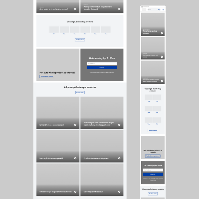
Cleaning products homepage
I contributed to the homepage redesign, prioritizing brand awareness and user engagement. My UX enhancements, including interactive hotspots, dynamic GIFs, and social media integration, aimed to improve website relevancy, personalization, and overall user experience. These changes led to an increase from 0.6% to 1% in site lift and a %13.6 decrease in bounce rate.
MY ROLE

Context and Challenge
This cleaning product brand, an industry leader, recognizes its website as a significant component of its sales process. Consequently, maintaining a current and user-focused online presence is a continuous objective.
The client aimed update their website to align with current trends and meet new by enhancing existing user experiences. They requested the removal of carousels due to low engagement as shown by their metrics. With a focus on mobile usability, I developed innovative alternatives that not only enhanced the user experience but also added new, optimized components to the design system.
Project Goals
Enhance user journeys once on the site through mobile first, consumer-centric UX.
Phase 1
The project's scope included three key UX elements identified for significant short-term gains: the homepage (above the fold) and the global navigation. My contributions were focused on the homepage redesign.
Research
I researched primary and secondary competitors, as well as inspiring e-commerce brands, analyzing their designs for both mobile and desktop. I found that the most common pattern was the combination of tiles with large images of real-life situations, relatable and human, avoiding typical stock photos. I also observed a growing interest in interactive elements such as hot spots, an idea that remained present until phase 3 of the project.
Iterative design
After analyzing the research results, I conducted several design explorations and developed detailed wireframes that were presented to the client. The final design selection was made by carefully considering the optimization of the user experience on mobile devices, as well as the scalability and ability to integrate interactive elements in future phases for increased user engagement.
Documentation for Developers
To accelerate the start of development, priority was given to documenting the global navigation (handled by other designer) and the "above the fold" section of the homepage (which is what I worked on). This detailed documentation of the design, functionality, behavior, micro animations and interaction of the components allowed the developers to build the site and integrate the visual and textual content once it was ready.

Phase 2
This new stage focused on optimizing the below the fold section of the homepage, including improvements to the design and functionality. Additionally, work was done on the newsletter subscription components of the site to increase user acquisition. A highlight of this phase was the development of an innovative social component, specifically designed for integration into the homepage.
The Process
My research showed common placements for newsletter signup forms, simple forms that only ask for an email address, and the growing trend of social media sections with curated content that is somehow linked to a product on the website. I also noted a trend of using large section layouts. Based on this, I developed component proposals and user flows for each element of this phase, being very descriptive in the functionality and rationale behind each one.
The Designs
Components featuring an attractive title, email input field, and a striking colored background. A less intrusive, first-time loading overlay, positioned in the bottom right corner, displays the same components. A "Thank You" version was included to confirm the subscription.
Phase 3
This phase focused on implementing ideas from phase 1 that were previously postponed due to time or budget limitations. We revisited the concept of using hot spots on the homepage to enhance user engagement.
Process
My research explored how interactive experiences function on both mobile and desktop platforms. I analyzed the density of interactive elements across various resolutions and identified common micro-animation patterns. The findings revealed that these experiences effectively deliver relevant information through user interaction, typically within a defined visual container.
Iteration
The primary challenge was designing an interactive component that seamlessly integrates into the client's homepage, rather than existing as a standalone landing page. The solution was a component optimized for diverse screen sizes, maximizing viewport real estate across devices.
Strategic hot spot placement was crucial. I established a designated area ensuring visibility across all resolutions while optimizing touch target sizes and spacing for intuitive and precise user interaction.
Building upon existing homepage elements, the final component incorporates significant enhancements. I considered the hot spots states and a subtle, constant pulsing micro-animation to attract user attention. Furthermore, clicking a hot spot triggers a modal displaying detailed information about the corresponding element and related products, enriching the user experience.
Dev documentation
Documentation for this component required meticulous attention to detail. Developers needed precise hot spot coordinates for various resolutions, in addition to standard technical specifications. Comprehensive documentation was created, encompassing details regarding dimensions, interaction, functionality, and precise hot spot placement for both desktop and mobile platforms.


New Branding
The client has revamped their brand identity, which will be gradually implemented across the website. As part of my role as UX designer, I collaborated with the team to create an engaging landing page for the launch campaign. Additionally, I developed a comprehensive guide for effectively applying the new branding to each section of the site. This guide covered adapting the style of components (inspired by the phase 1 homepage design, using tiles and rounded corners), updating images to reflect the new style, replacing the primary color and incorporating an expanded color palette, revising the tone of voice in headlines for specific sections, and proposing new micro-interactions to enhance the page load experience.
Project Details
CLEANING PRODUCTS BRAND | 2024
This project and all its assets are the intellectual property of Create the Bridge, and the brand this was worked for. My work is displayed here for portfolio purposes only.
Team
PROJECT MANAGER
SENIOR UX/UI DESIGNER*


