Good Morning Branding
I led the branding process for this local coffee brand. The project aimed to develop a comprehensive visual identity for "Good Morning." This brand is designed to enhance the sunrise experience, offering more than just an ordinary cup of coffee. The creative journey involved shaping the brand's personality and developing a unified visual identity.
The result is a brand that invites consumers to start their day with a cup of coffee and a smile.
MY ROLE

Context
This project involved a local food truck aiming to capture a young audience with its beverages and food. While the initial concept focused on youth appeal, market research uncovered significant opportunities in previously overlooked segments.
Inspired by the client's name, "Good Morning", I developed a concepts that reflected warmth and positivity. A personal client request to incorporate a cricket into the logo was key, adding a unique and meaningful touch to the brand.
Project Goals
01.
To create an engaging visual identity that embodies the brand's values and attributes.
02.
To design a brand capable of resonating with two distinct target audiences.
03.
To develop an iconic character, a cricket, to forge a connection with the audience.
CHALLENGE & OPPORTUNITY
A competitive landscape with a significant on-site absence
The Competitors
The challenge was to stand out in a highly competitive market, where consumers are constantly bombarded with exciting new options. However, my research uncovered a compelling market gap: students and faculty at a major Morelia university had limited on-campus coffee choices, with no local competitors offering an appealing alternative. This revealed a significant, untapped demand.
The Target
I conducted market research and audience segmentation based on demographics and behavioral patterns, which identified two key audiences:
-
Students (18-23 years old): They seek coffee as an energizer and a symbol of social status. They tend to be receptive to visually appealing brands and dynamic content.
-
Teachers (30-50 years old): They prioritize coffee quality and convenience during their workday, being more selective and guided by the functionality of the product and service.
KEY CONCEPTS
Brand personality
01
Joviality
02
Vitality
03
Energy
04
Warmth

The Logo
A custom typography, with organic and rounded strokes inspired by coffee steam, was designed to capture the attention of a young audience. This font, which conveys confidence and joviality, is complemented by a color palette that evokes warmth, energy, and vitality, creating a cohesive and attractive visual experience.


The Character and graphics
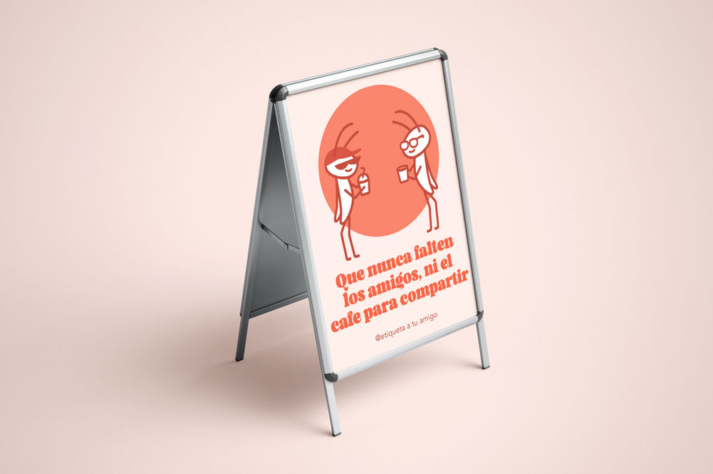
Following the client's request for a cricket feature, I developed a main character to humanize the brand and foster an emotional connection with the audience. This caricatured, stylized design conveys tranquility through its soft expression, ensuring versatility across various formats. I also created secondary characters to resonate with diverse qualities. Additionally, I added a texture and and graphic elements to elevate the brand's visual communication and promotional materials.


Brand Visuals
A range of graphic materials were developed for the brand, including food packaging, printed advertising (posters and banners), employee uniforms (aprons), and menus.
Swag
To extend the Good Morning brand experience, a collection of printed merchandise like t-shirts, mugs, tote bags, and stickers was developed for customers to carry.


Project Details
GOOD MORNING | 2024
Solo Project
SENIOR BRAND DESIGNER*


